Unlocking the Power of Data Visualization: My Experience with #30DayChartChallenge
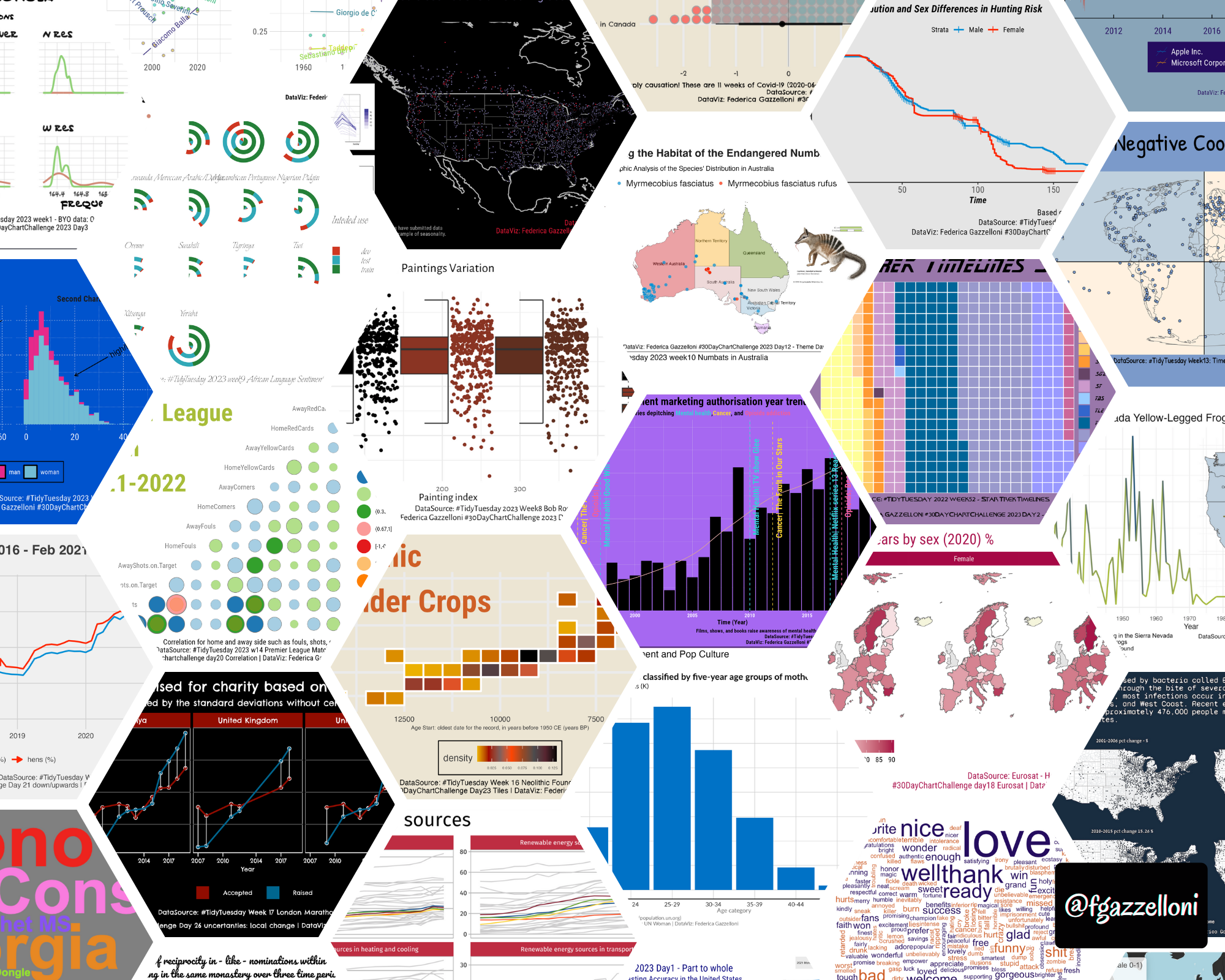
Welcome to Federica Gazzelloni’s #30DayChartChallenge website, where data meets creativity! This is a companion website of the original 30daychartchallenge.org.
If you’re someone who loves data and is always on the lookout for new and exciting ways to represent it visually, then you’re in the right place.
The #30DayChartChallenge is a global event that brings together data enthusiasts, professionals, and novices alike, to create and share 30 different types of data visualizations over the course of a month. You’ll find more information here:
From basic bar graphs to complex interactive maps, our community of chart makers pushes the boundaries of data visualization with each passing day. Each chart is accompanied by a description that explains the data source, methodology, and insights that can be drawn from the visualization. Our goal is not just to create beautiful charts, but to also make them informative, thought-provoking, and engaging.
Whether you’re a data analyst, designer, or simply someone who’s curious about the world around them, you’re sure to find something that piques your interest on our website. So come join us on this journey of exploration, experimentation, and creativity. Let’s chart the world, one day at a time!