df <- read.csv("https://ourworldindata.org/grapher/death-rate-in-armed-conflicts.csv?v=1&csvType=full&useColumnShortNames=true")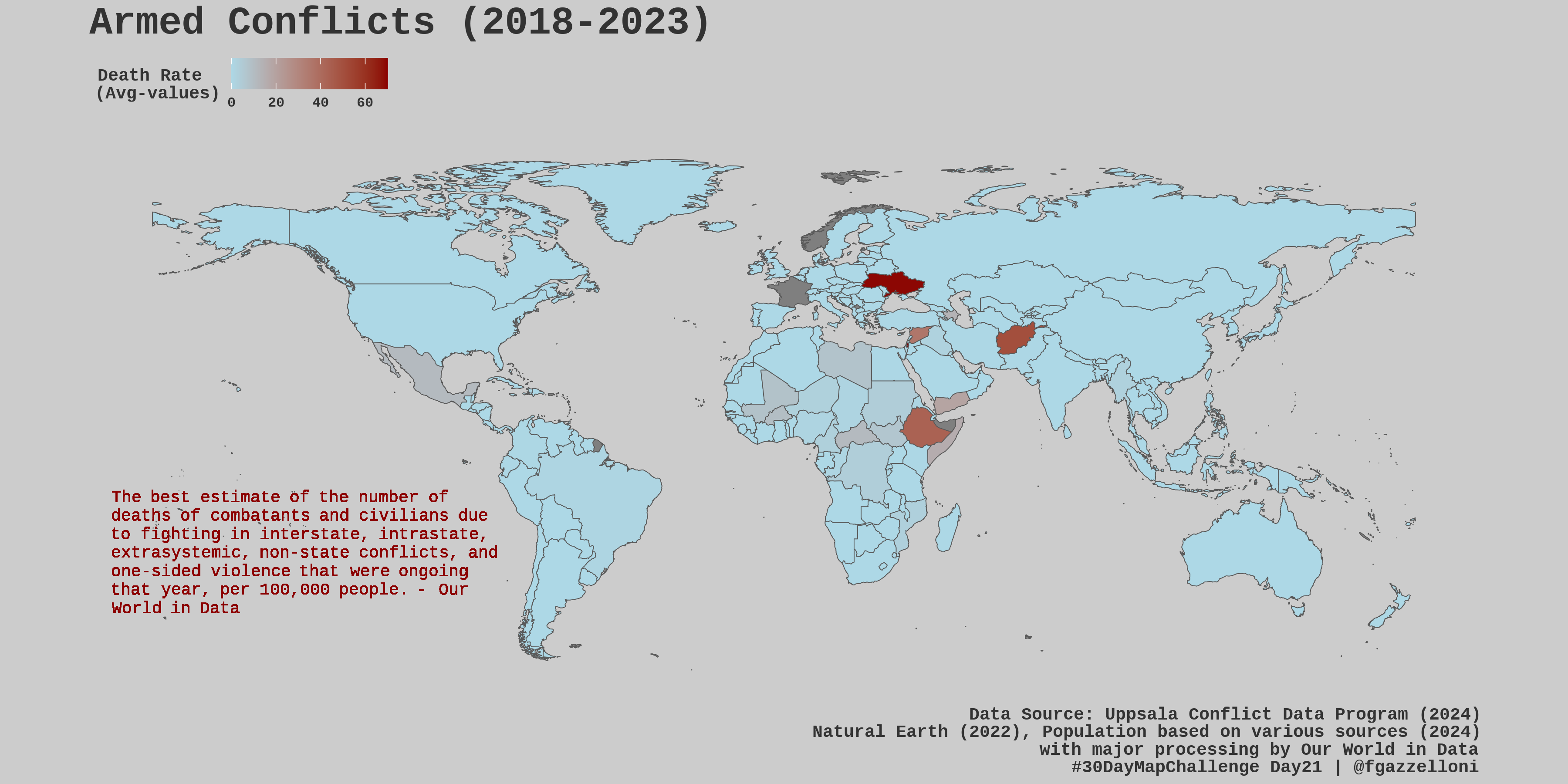
df%>%filter(Entity=="Spain")death_rate <- df %>%
filter(Year>=2018,
death_rate__conflict_type_all>0) %>% # 2018 - 2023
group_by(Entity,Code) %>%
reframe(Deaths = round(mean(death_rate__conflict_type_all),2))
death_rateDataExplorer::profile_missing(death_rate)death_rate%>%filter(Entity=="Spain")library(rnaturalearth)
world <- ne_countries(scale = "medium", returnclass = "sf") %>%
filter(!name=="Antarctica")death_rate_sf <- left_join(world, death_rate, by = c("iso_a3" = "Code"))text <- c("The best estimate of the number of deaths of combatants and civilians due to fighting in interstate, intrastate, extrasystemic, non-state conflicts, and one-sided violence that were ongoing that year, per 100,000 people. - Our World in Data")map <- ggplot(data = world) +
geom_sf(fill=NA) +
geom_sf(data = death_rate_sf,
aes(fill=Deaths)) +
labs(title = "Armed Conflicts (2018-2023)",
caption = "Data Source: Uppsala Conflict Data Program (2024)\nNatural Earth (2022), Population based on various sources (2024)\nwith major processing by Our World in Data\n#30DayMapChallenge Day21 | @fgazzelloni",
fill = "Death Rate\n(Avg-values)") +
ggthemes::theme_map() +
theme(text = element_text(family = "mono", color = "grey20", face="bold"),
legend.position = "top",
legend.background = element_rect(fill="transparent"),
plot.title = element_text(size=20),
plot.caption = element_text(size=9))
mapmap +
scale_fill_continuous(low = "lightblue", high = "darkred") +
ggtext::geom_textbox(
x = -135, y = -45,
width = 0.3, height = 0.5,
label = text,
size = 3,
family = "mono",
color = "darkred",
fill = "transparent",
box.color = "transparent"
) save it as png
ggsave("day21_conflicts.png",
       bg="grey80",
       width = 12, height = 6,
       units = "in", dpi = 300)