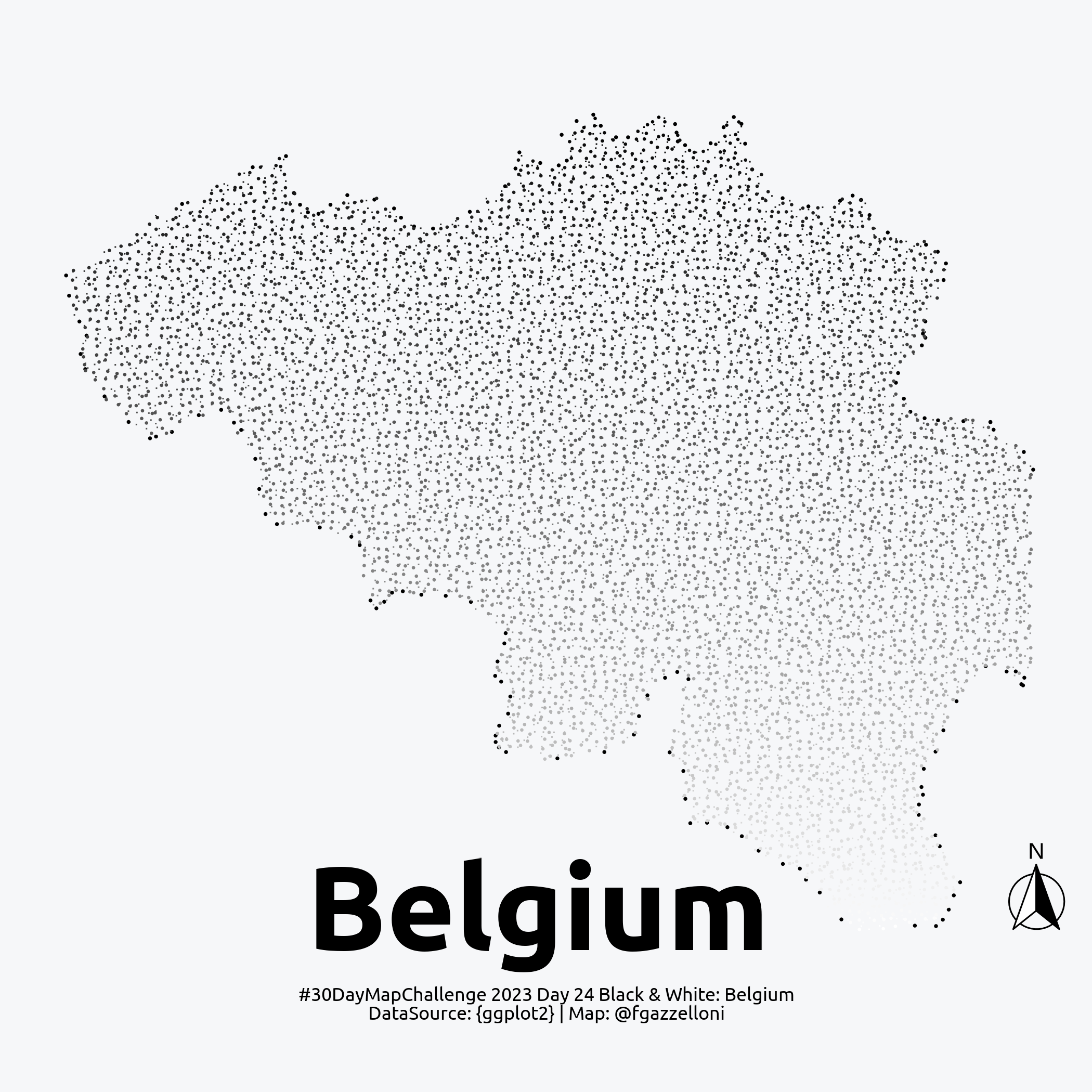
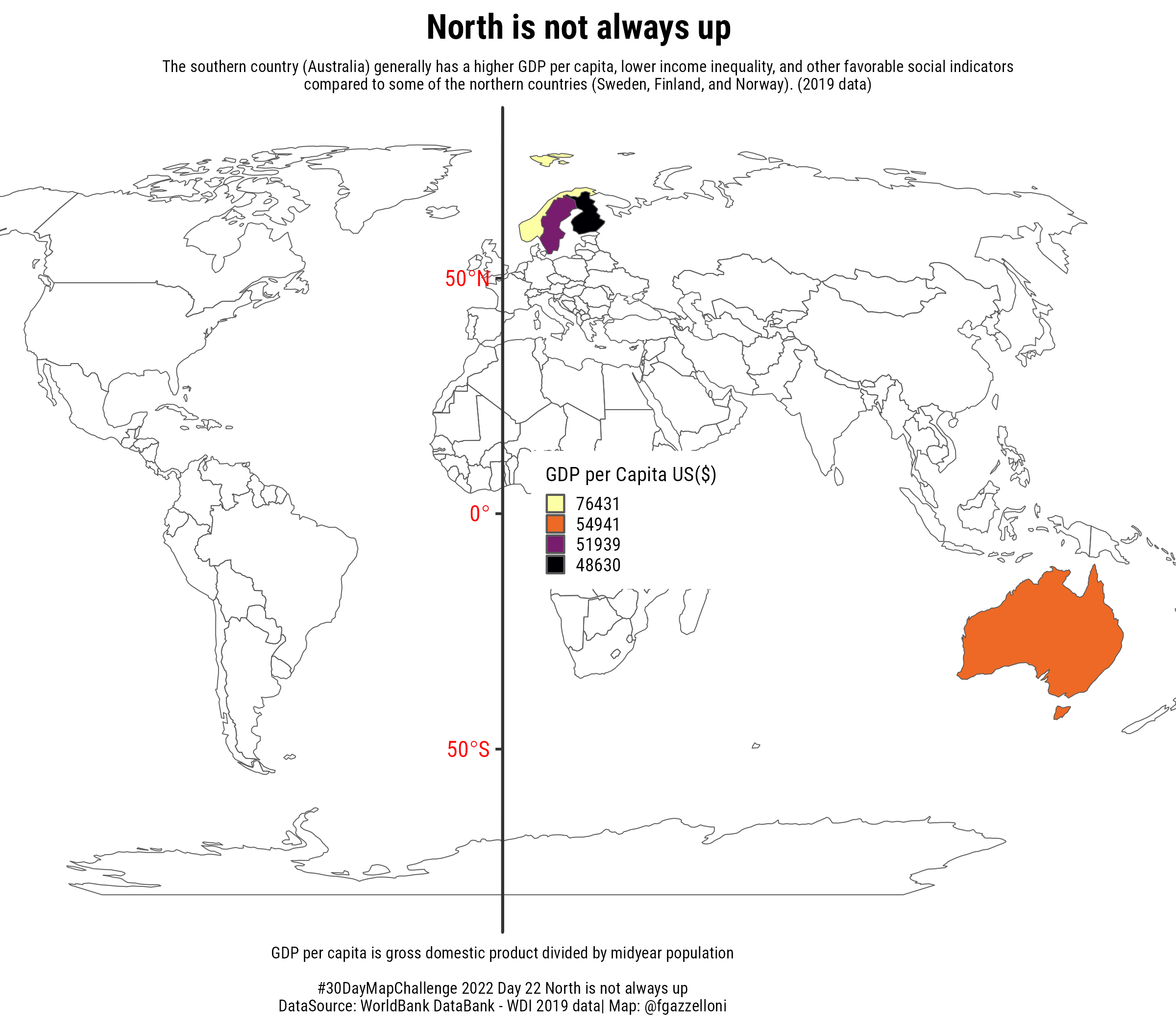
{tma…
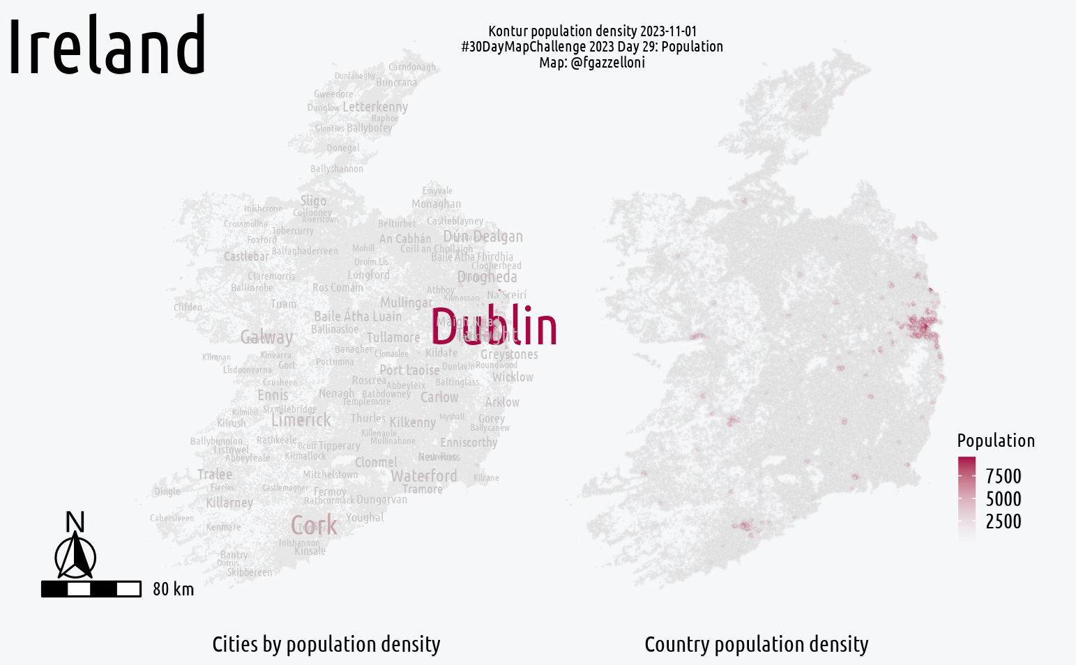
Ireland Map
Kontur Population
United Nations Humanitarian Data Exchange (HDX)
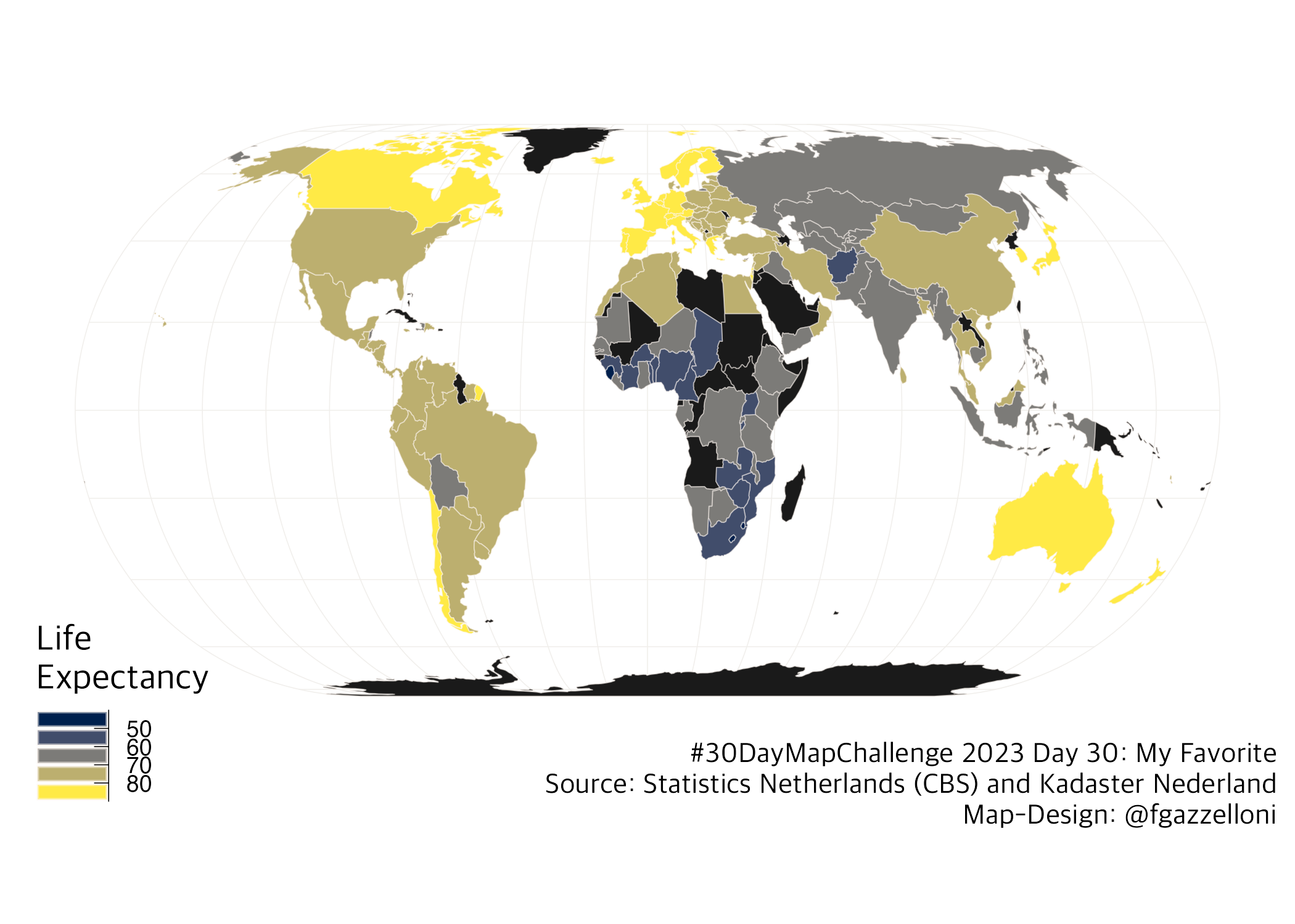
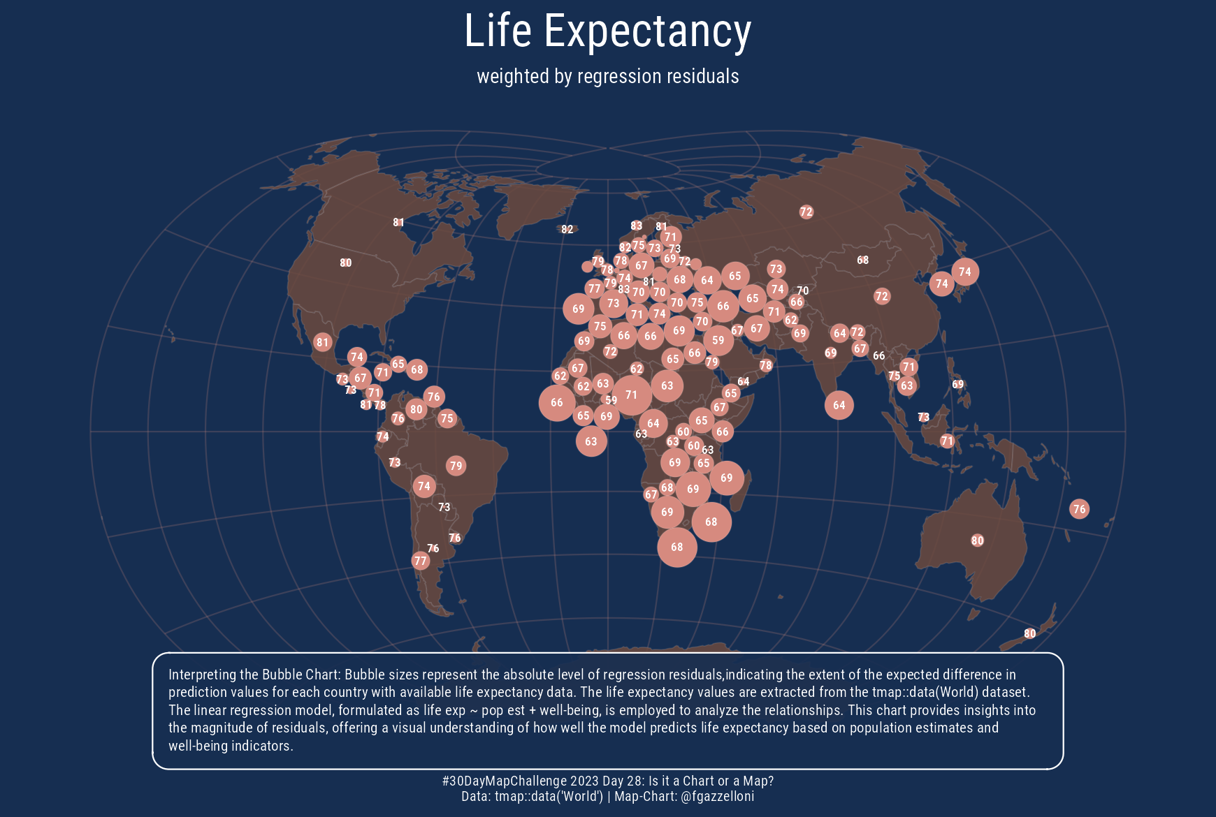
tmap::data("World")
EPSG Geodetic Parameter Dataset (also EPSG registry)
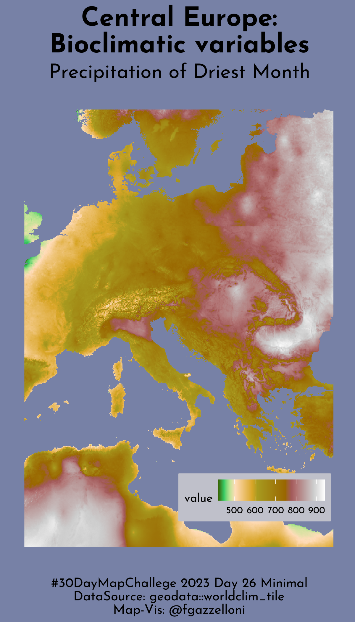
worldclim
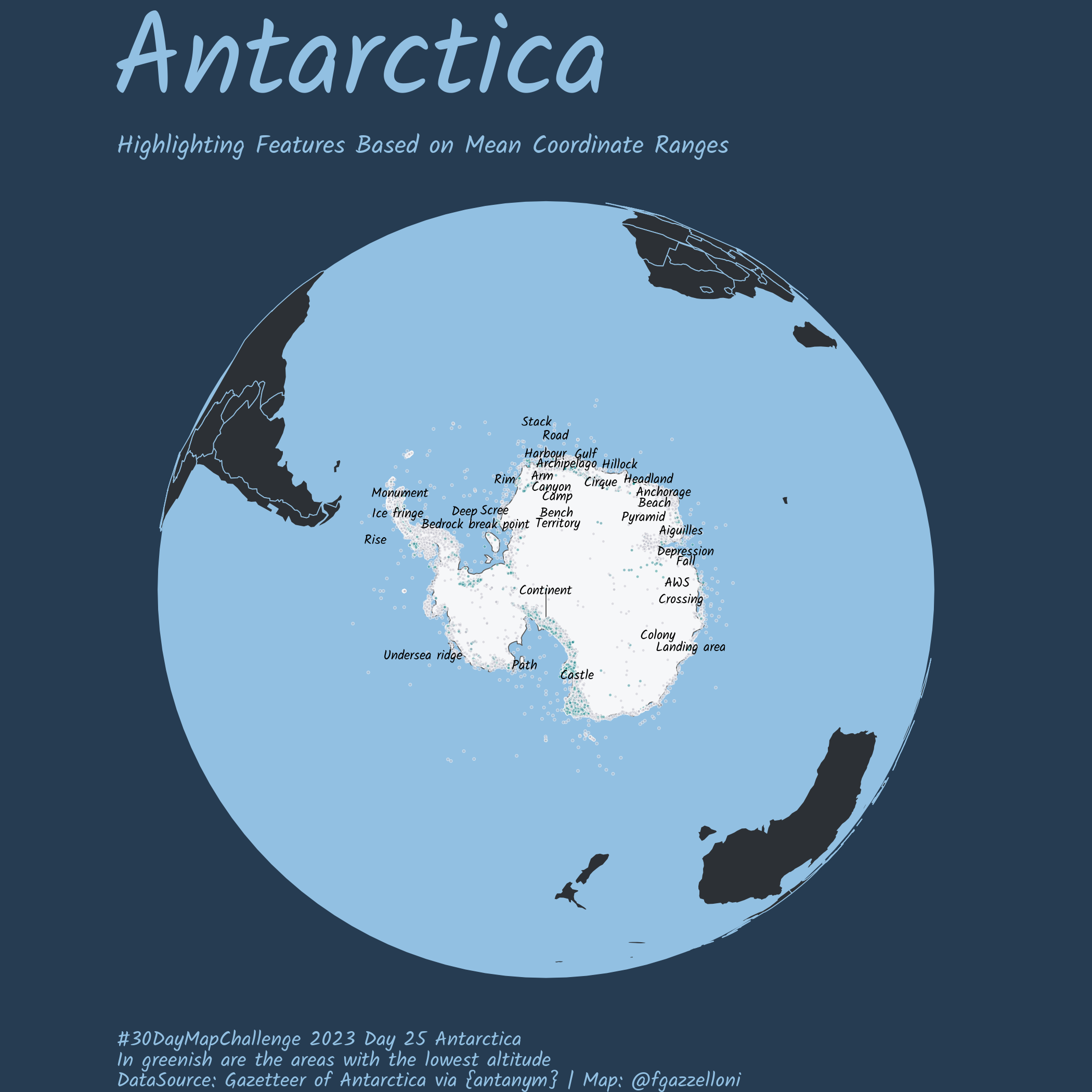
rOpenSci {antanym}
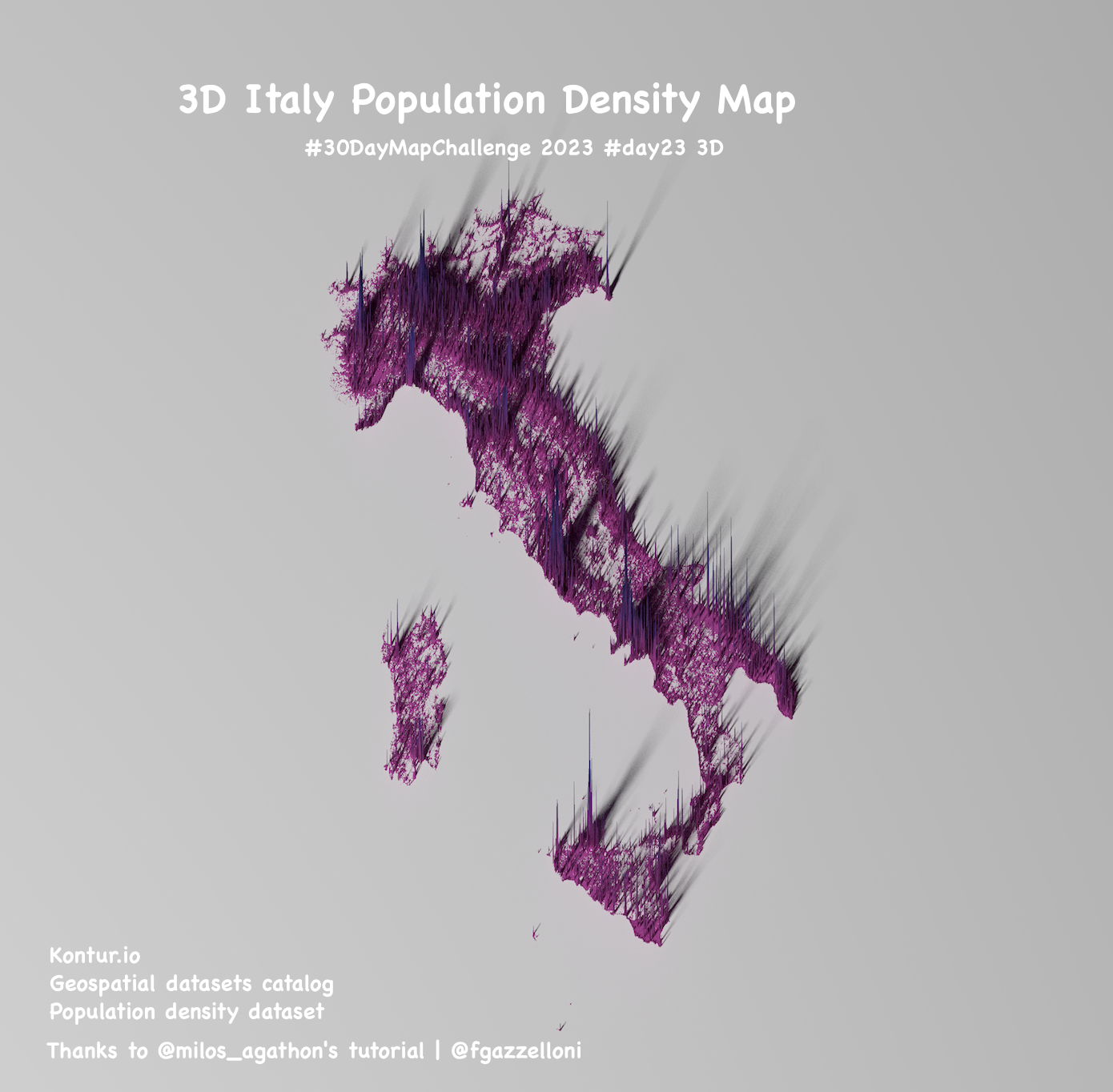
Milos Agathon: Milos Makes Maps
…
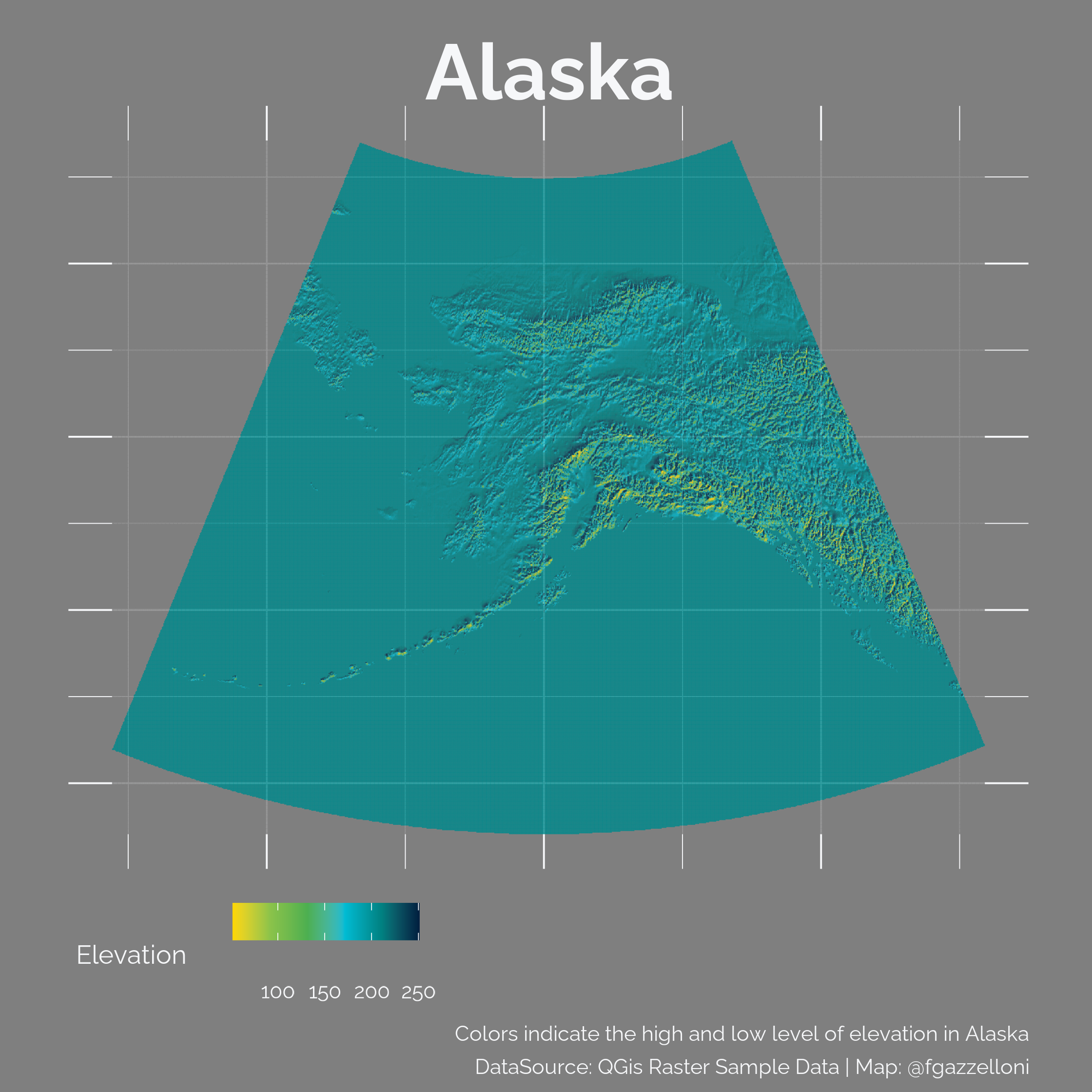
Raster Map
World
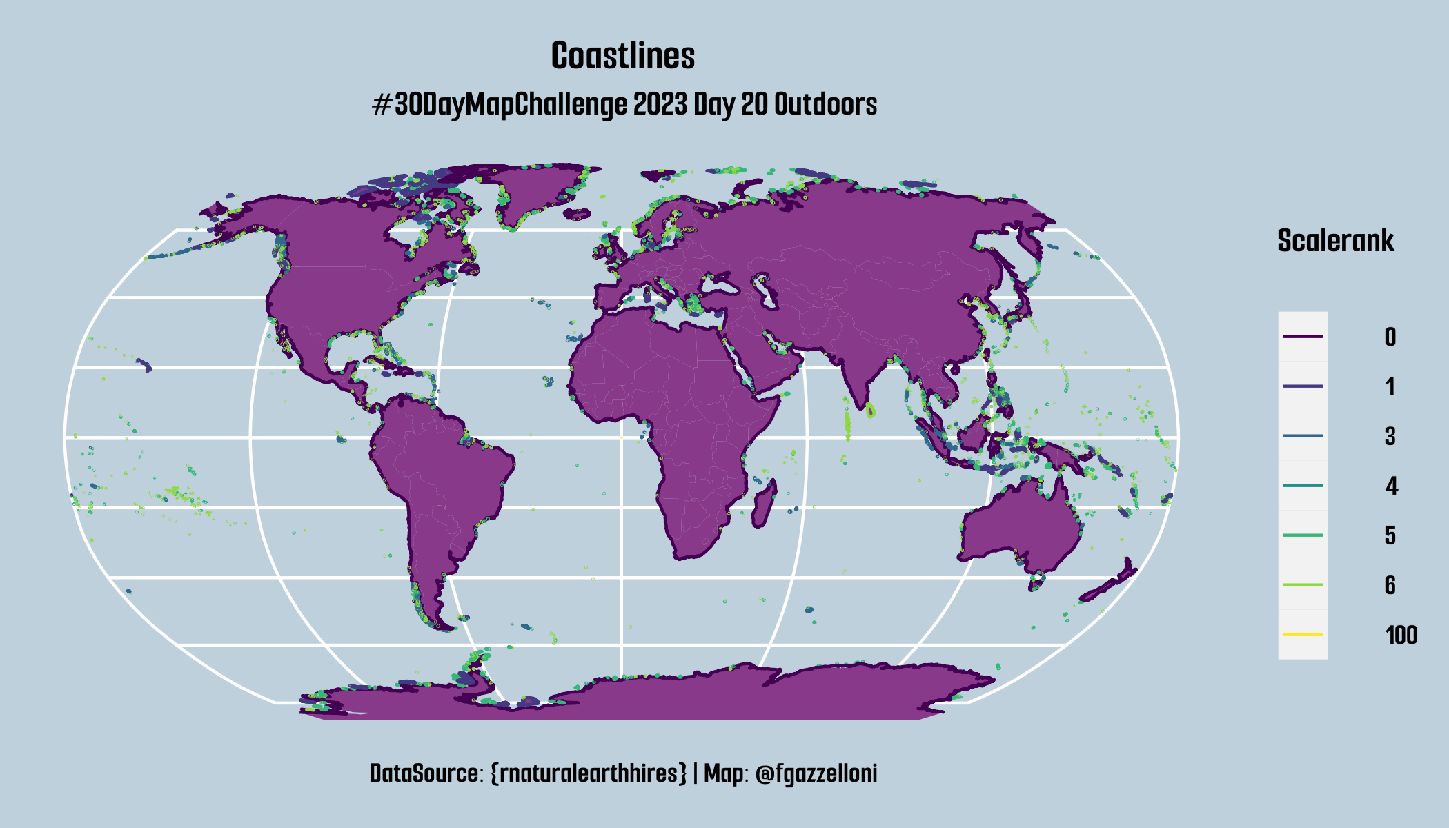
{rnaturalearthhires}
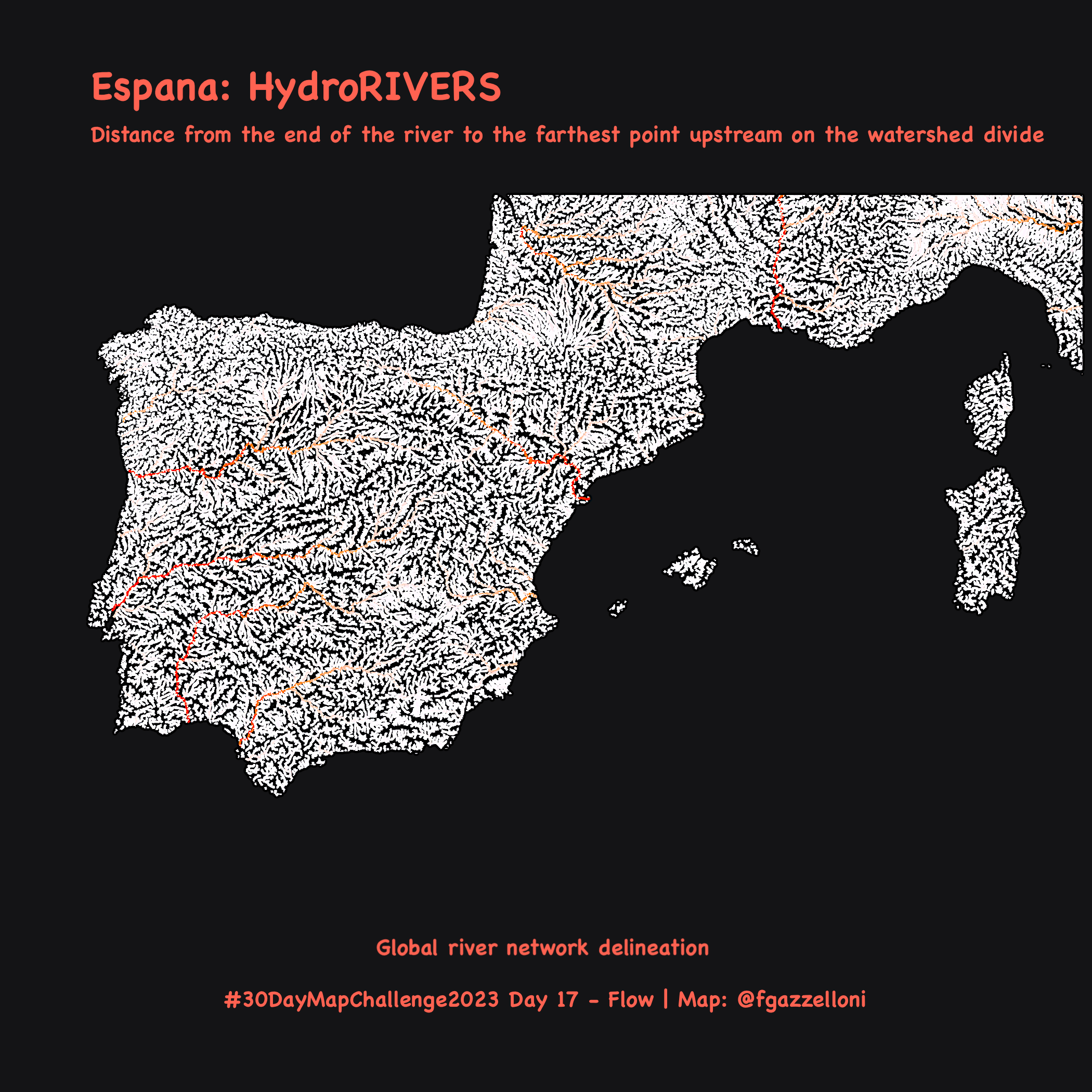
HydroRIVERS
DIST_UP_KM
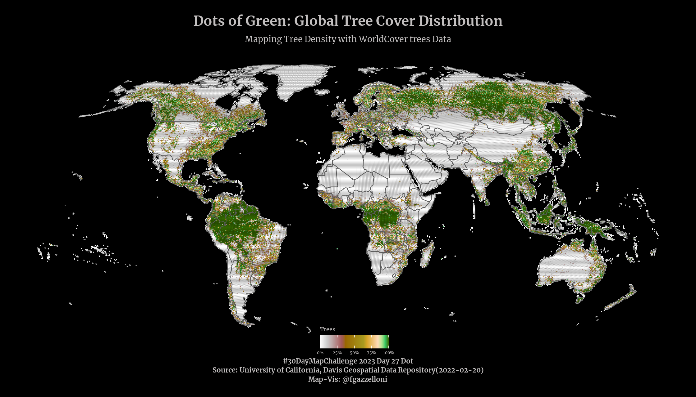
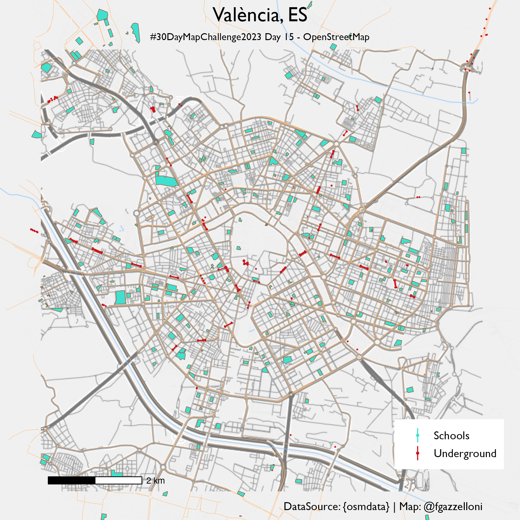
OpenStreetMap
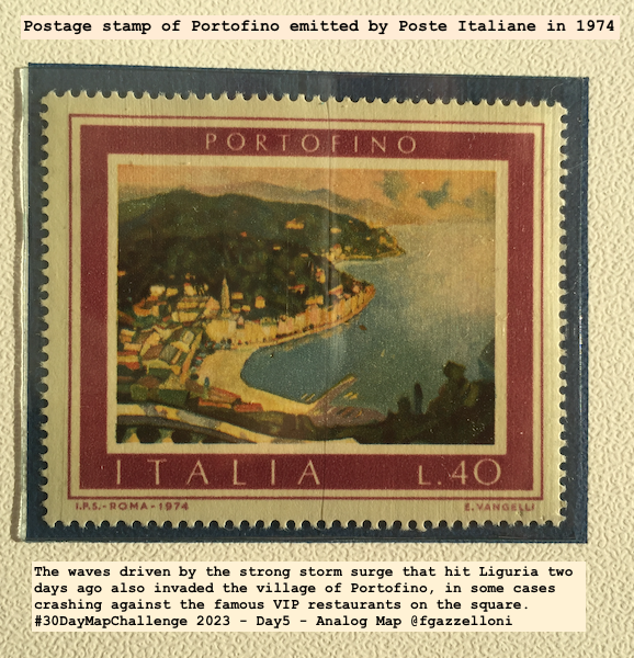
Valencia
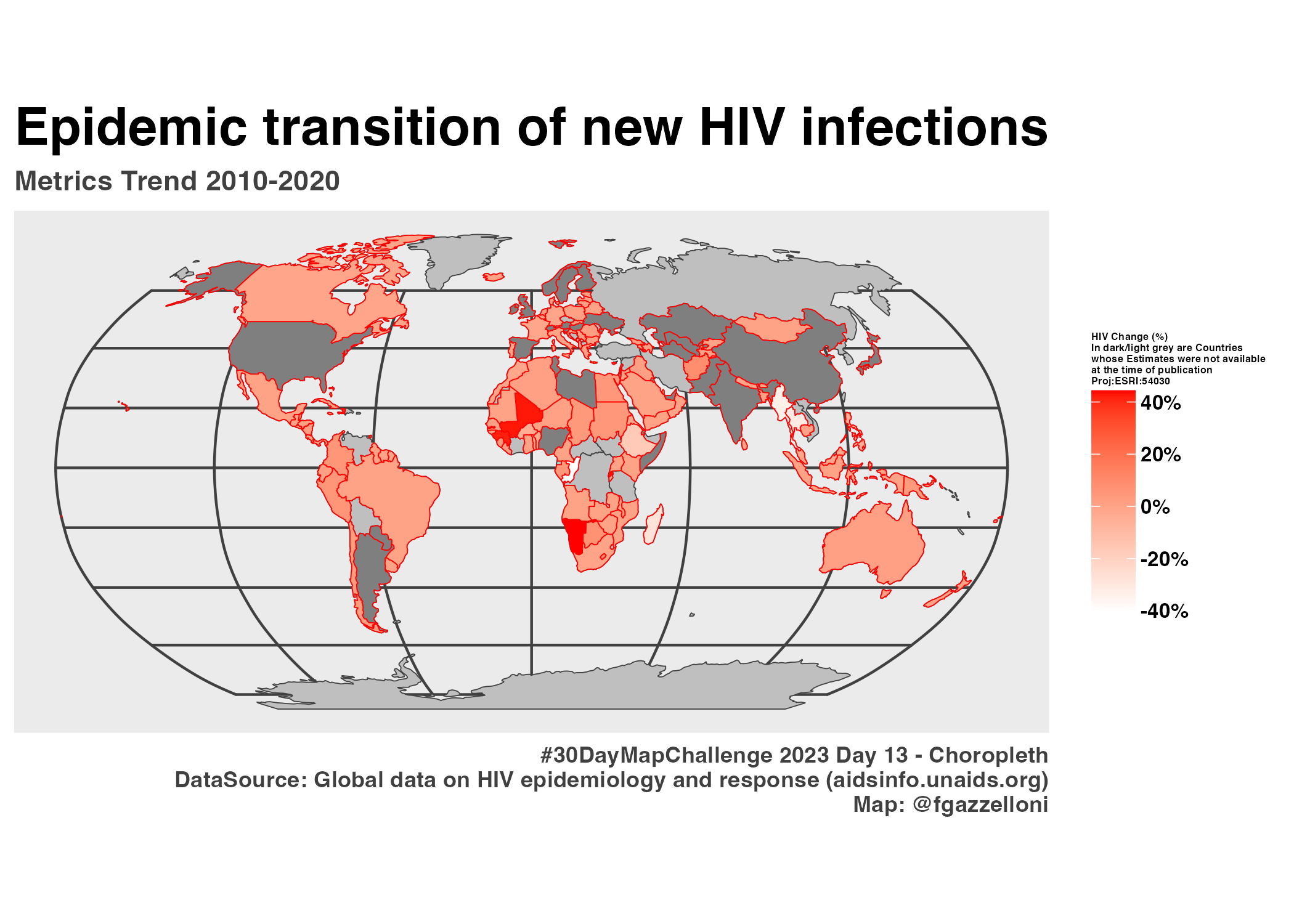
Eurostat
{eurostat}
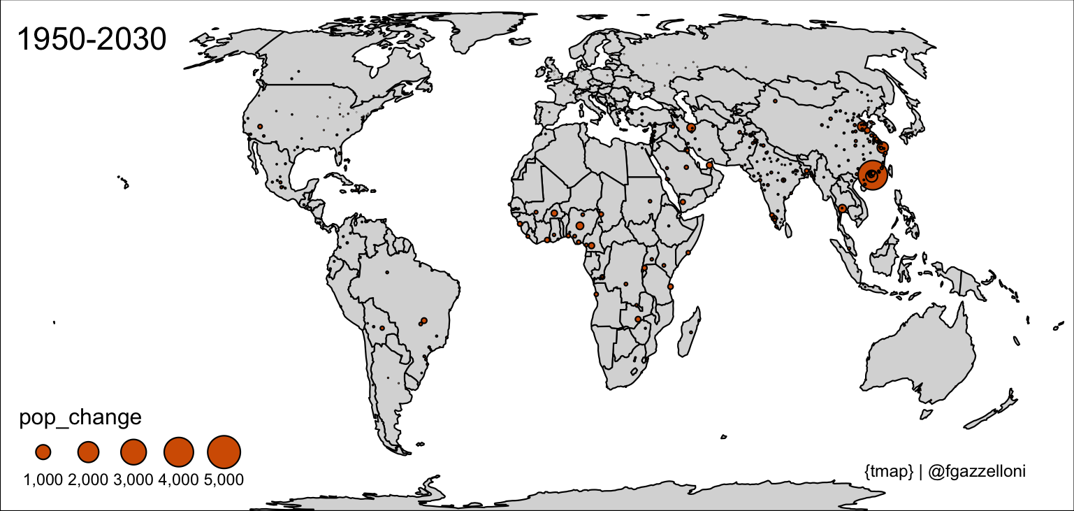
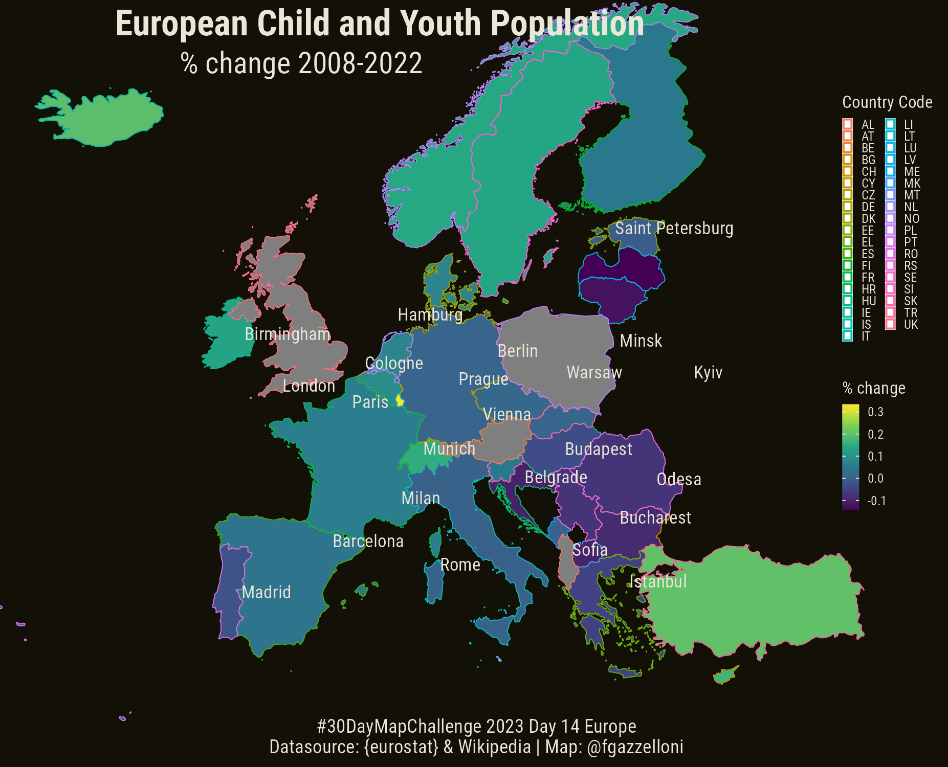
European Child and Youth Population
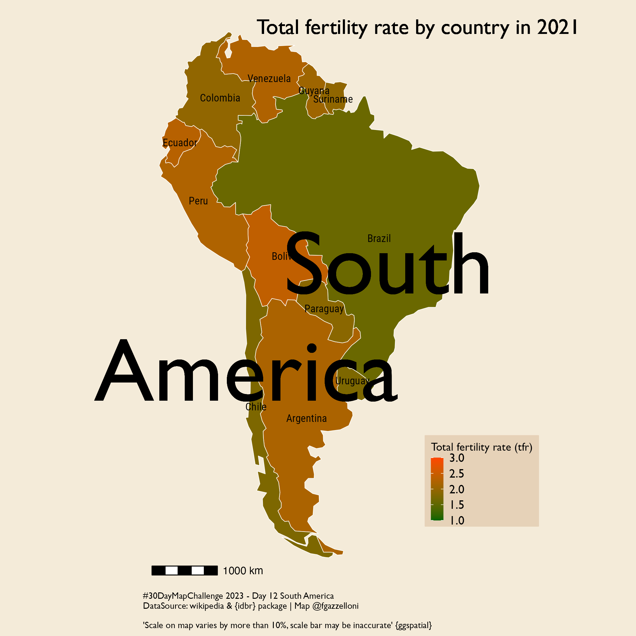
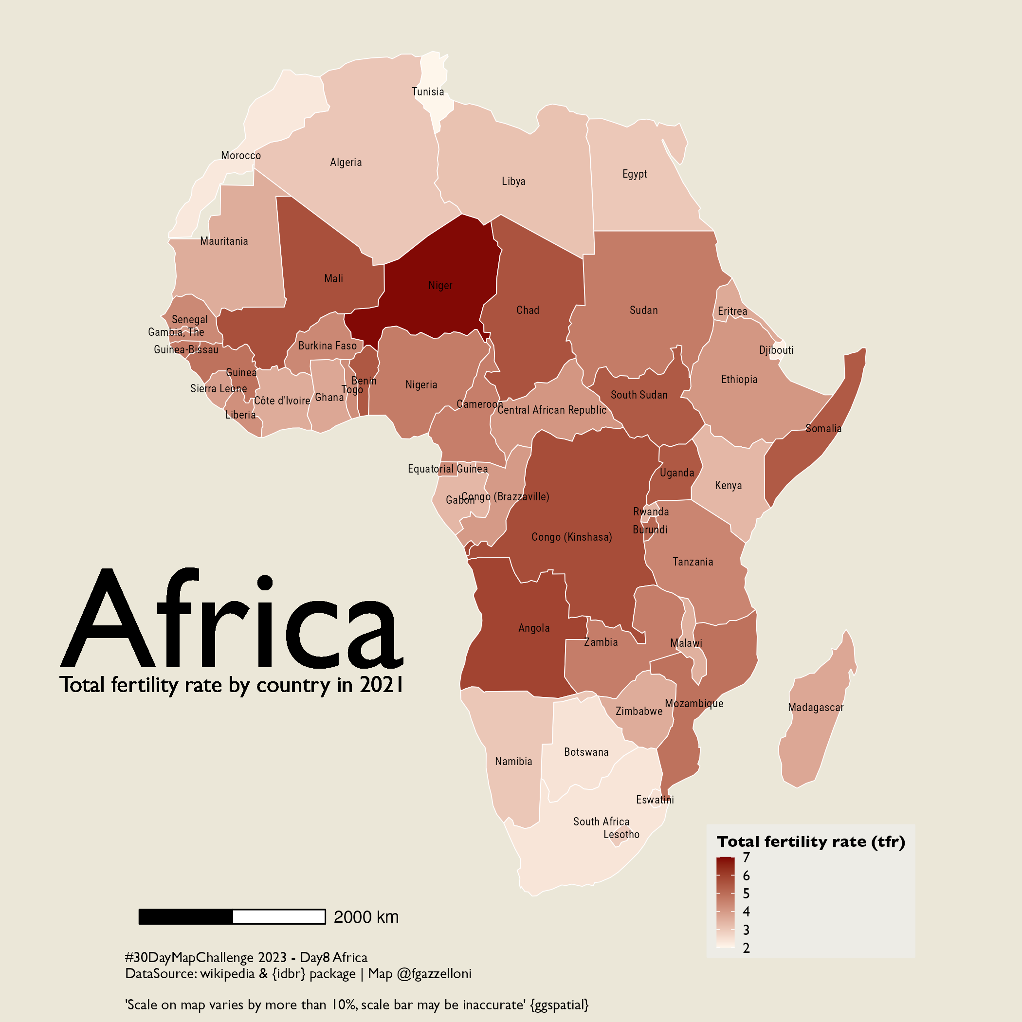
total fertility rate
South America
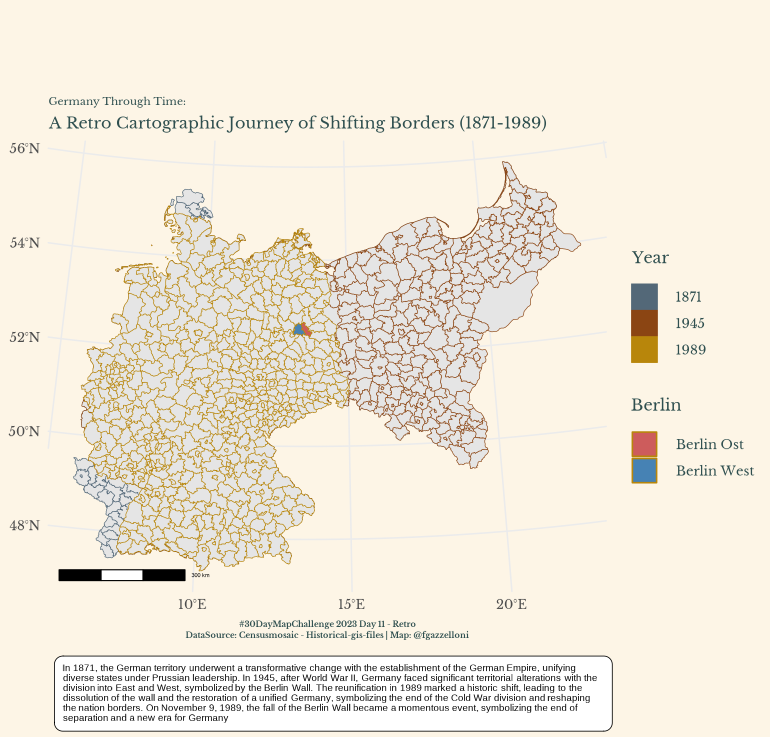
Berlin, Germany
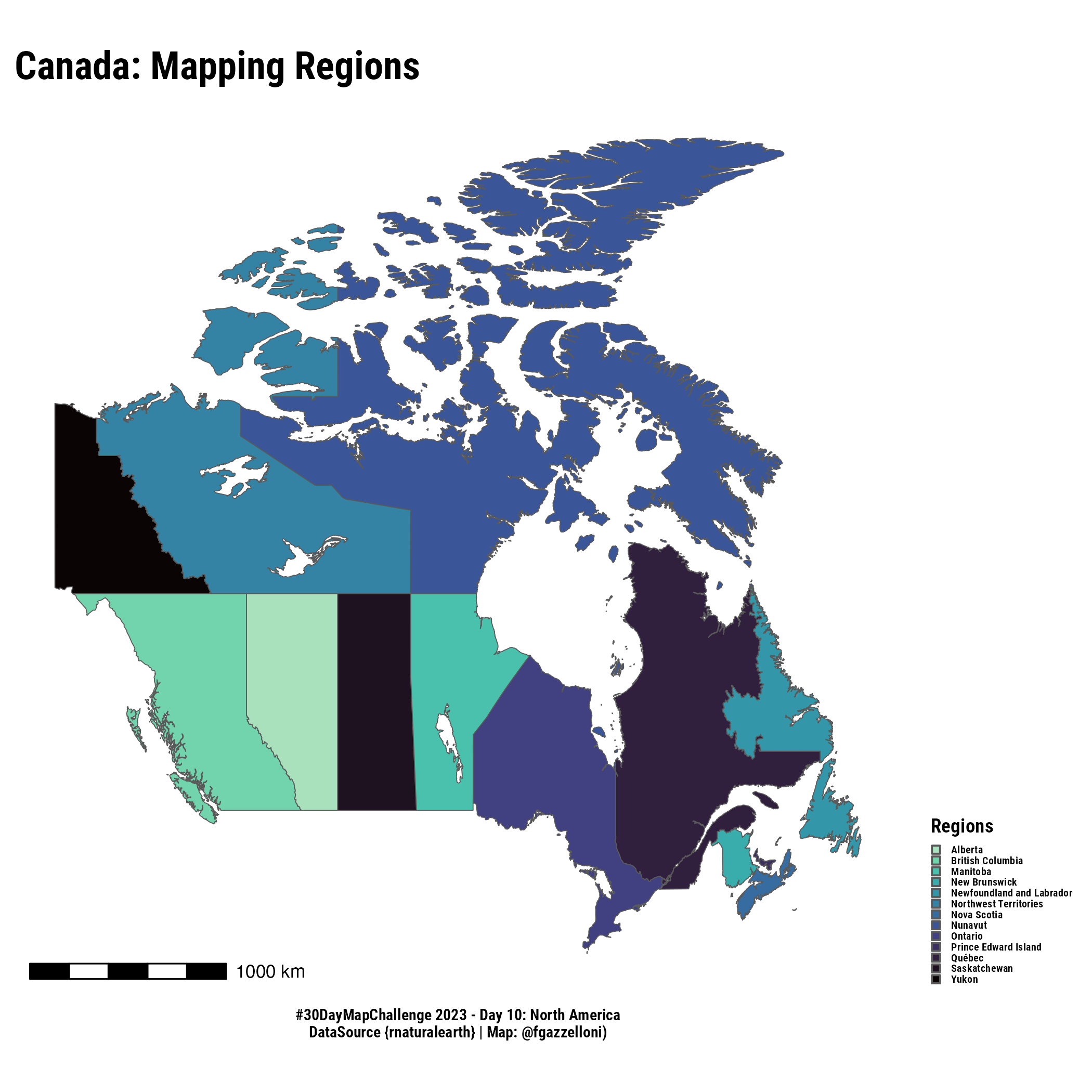
Canada
rnaturalearth}
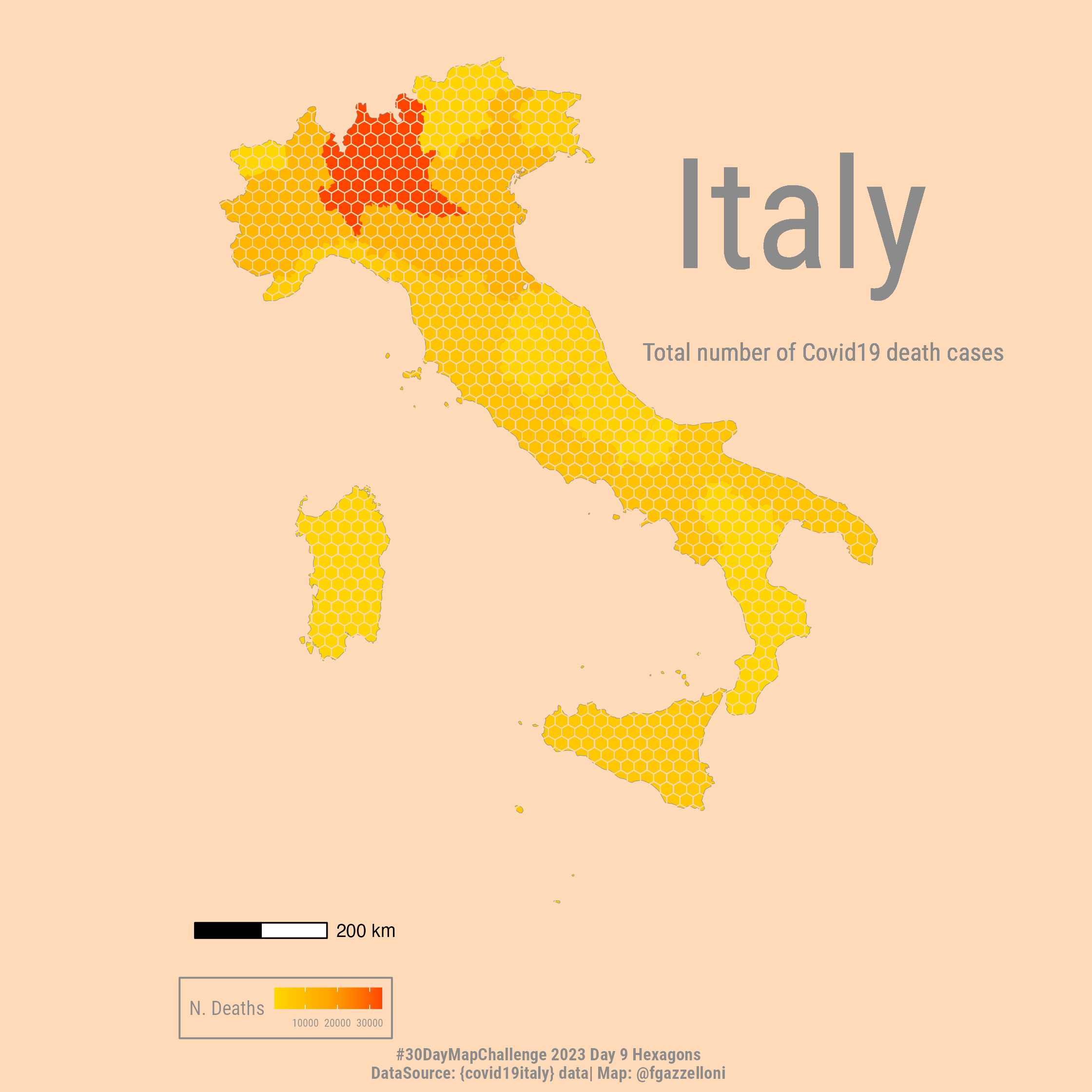
{covid19italy}
{idbr}
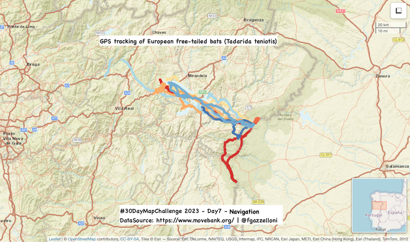
3D flights of European free-tailed bat
individual.local.identifier
bats
Tadarida…
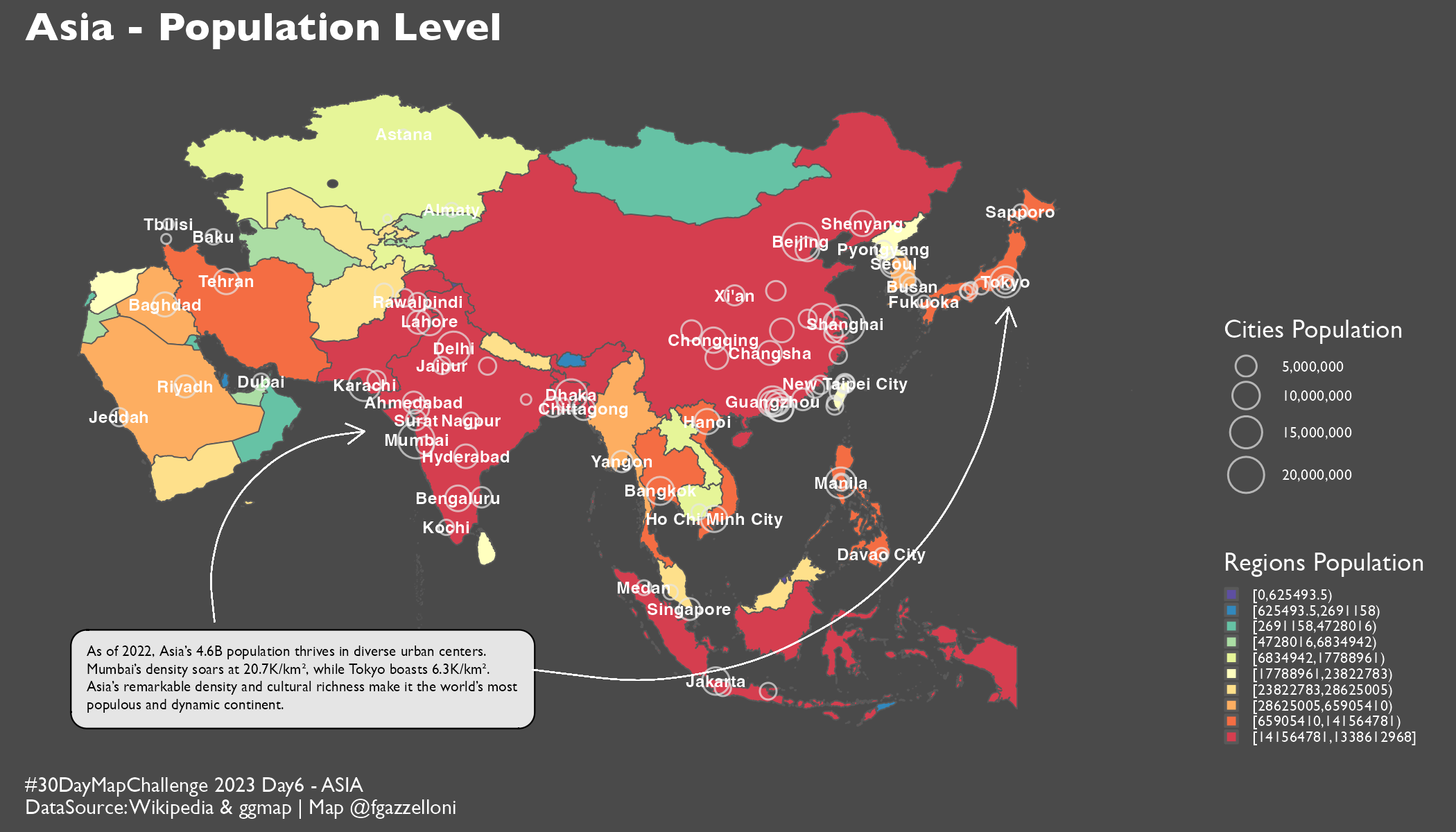
#30DayMapChallenge 2023 Day6 - Asia
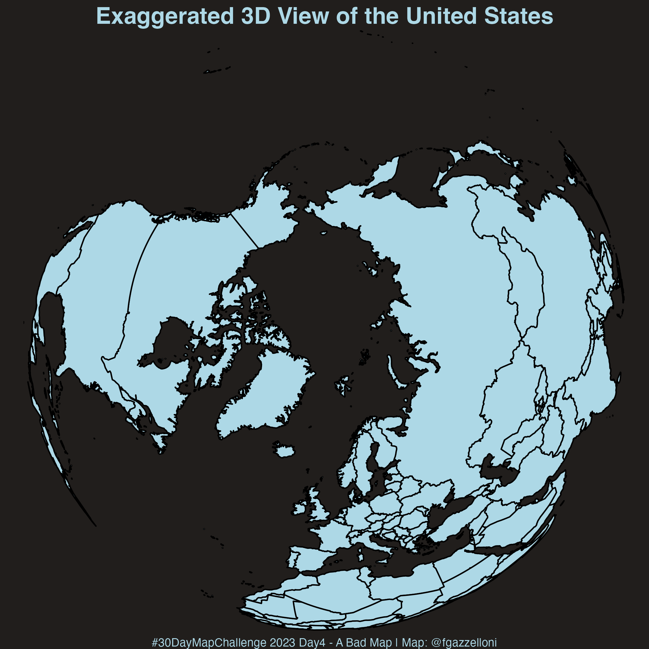
Exaggerated 3D View of the United States
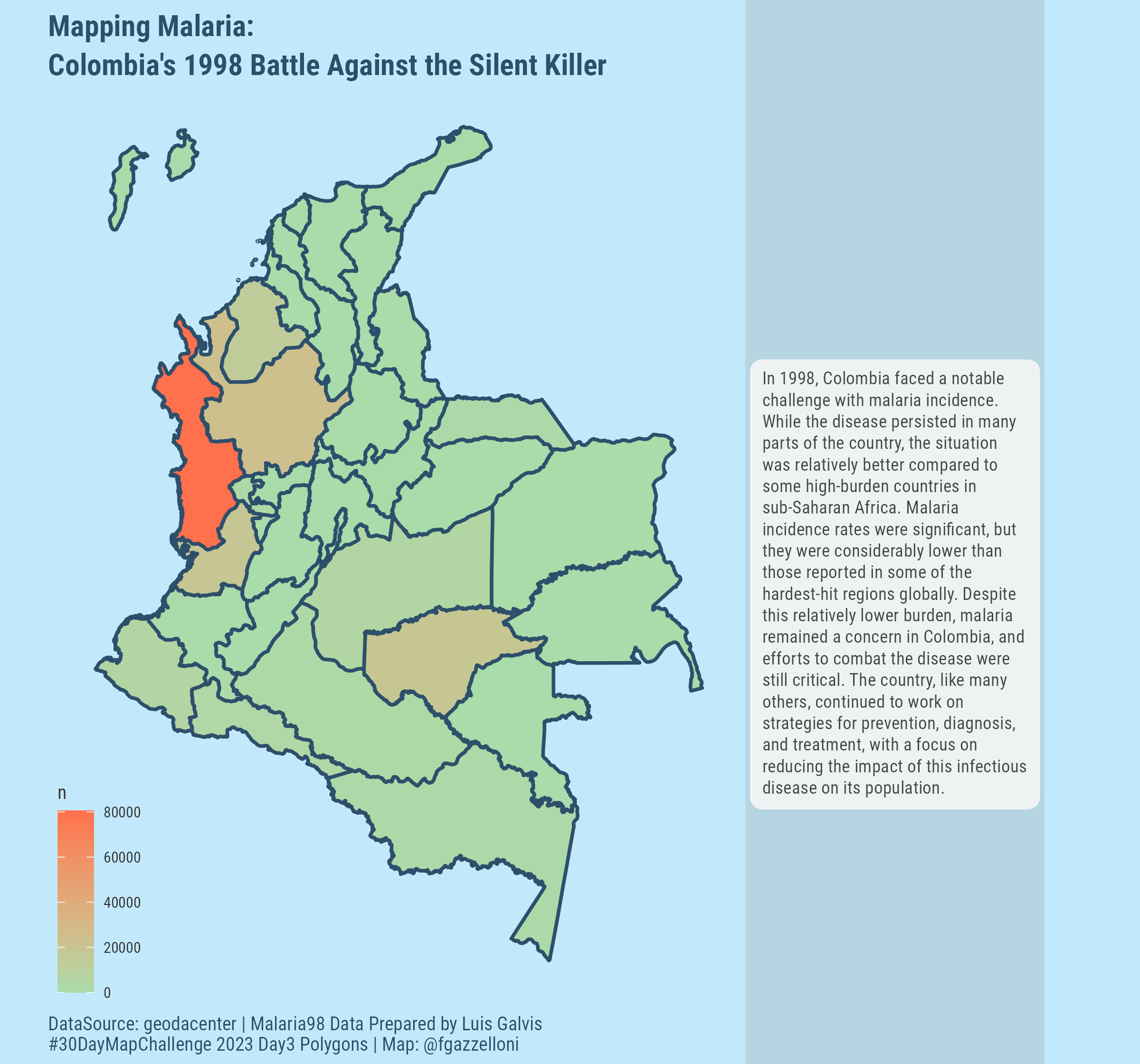
Colombia Malaria incidence
Geodatacenter
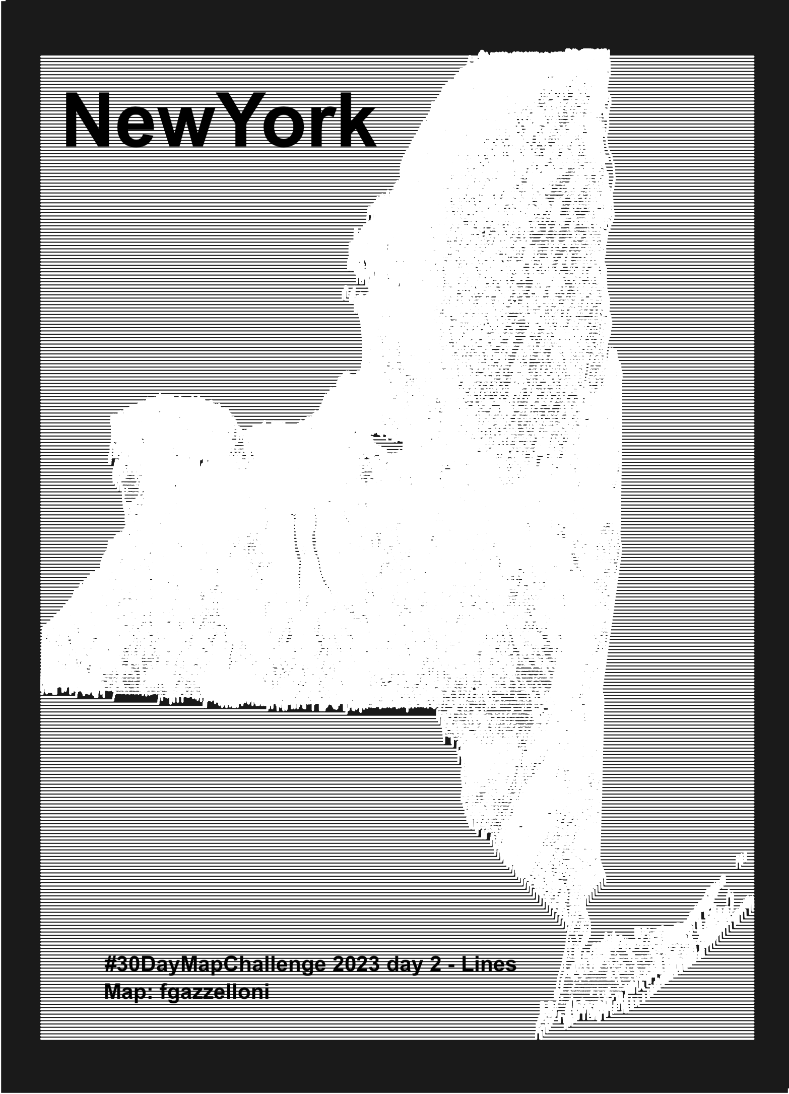
NewYork
Geospatial Data Gateway
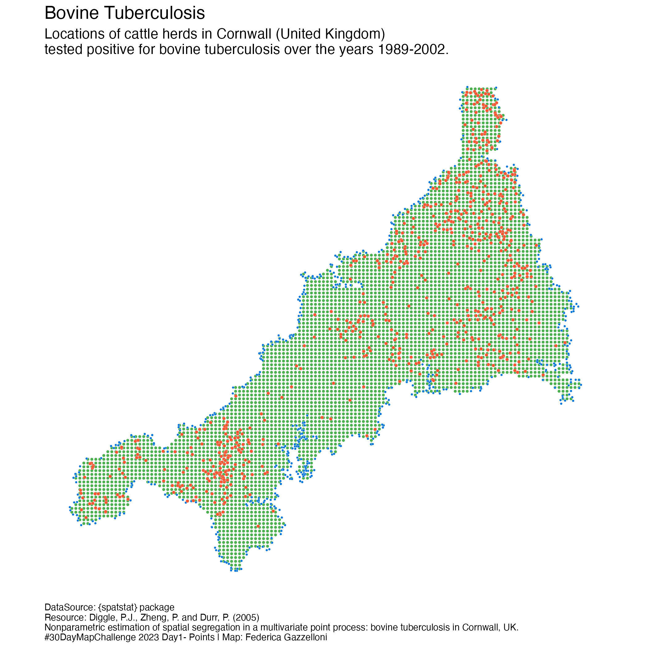
Bovine Tubercoulosis Farm Locations in Cornwall
{spatstat}